We think it's worth it to quantify what progress means for your clients. This is why we heavily encourage the use of Metrics.
The Data Lab - Single Field report lets you take the data you've collected in the form of metrics and form inputs, and sculpt it into something meaningful. Find this report in Reports >> Data Lab >> Single Field.
Available Data Fields
First, click on the dropdown field next to Load. There you'll see all available data fields to run a single field report on.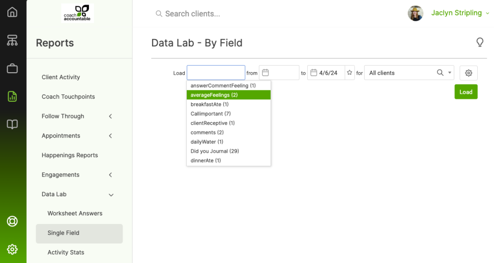
These fields come from:
- Metric data
- Form-based fields (from either Worksheets or Session Notes)
Note that only fields with 2 or more recorded data points will show in the dropdown. Otherwise, the report would be quite empty! This means that, for example, newly created fields in a brand-new Worksheet Template won't show in this dropdown.
The number next to the field name tells how many data points are available. In the example pictured above, we have 11 data points available for our field named "activities", 22 data points for "averageFeelings", and so on.
Other Report Criteria
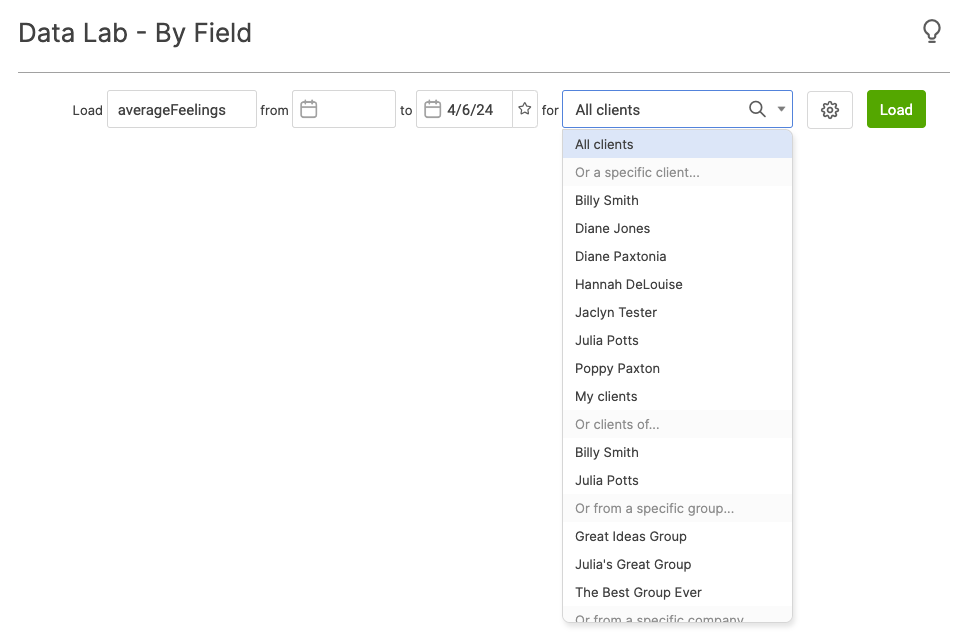
Next, select the date range. Leave the first date blank to include all activity.
Choose which clients to include. You can include:
- All clients
- One specific client
- For Team Edition accounts, only clients paired with a particular coach
- Only clients from a specific Group
- Only clients from a specific Company
Next, click on the gear icon for further customization.
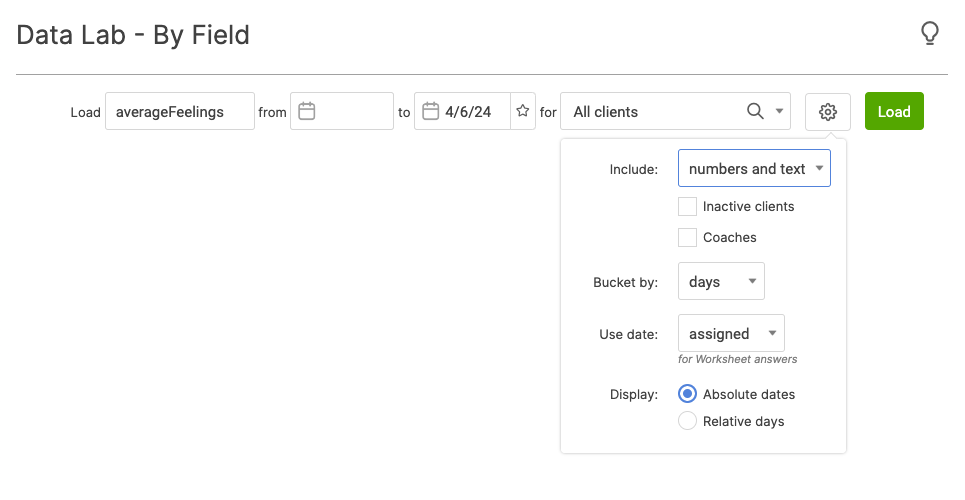
Here you'll determine whether to include numbers, text, or both.
Including text data is useful for gathering the full context of a Metric by including both its number and any comments, or for running a report on a text-based answer, such as one asking for suggestions for improvement for your coaching program.
Choose to include inactive clients if you like for a more full data set.
For Team Edition accounts, you can choose to include the primary coach's name as a field on the report as well.
You can aggregate data by days, weeks, or months. Which bucket you choose depends on how deep you want to look into your data. Consider this example, where we're looking at clients' Weight metrics. Weight is being bucketed by day:
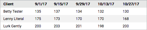
And now this example, where Weight is being bucketed by month:
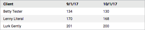
The first example allows for a deeper look at how weight changed. The second example, which shows only the data at the first of the month, could be more useful in summarizing longer periods of time, where you don't need to look at every single data point and only need to see a general trend.
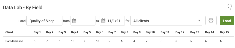
Display by absolute days or relative days. Displaying by absolute days will list your data by calendar dates. Relative days, on the other hand, can help you see how a data set changes over time in relation to when someone started working with you, for example.
Consider this example, where Mikayla and Patrick started measuring the same thing, but Patrick started one day after. Here's how it looks when reporting by absolute days (notice the calendar dates above the data points):
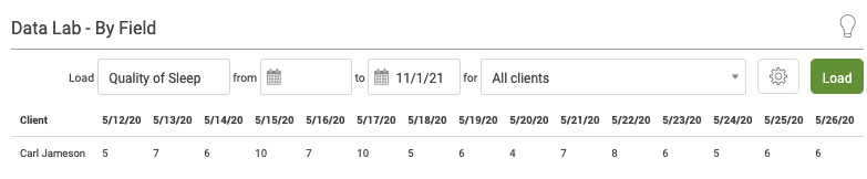
And the same report run by relative days.
After making all your selections, click Load and you'll have your single field report.
You can download the report to CSV, allowing for further analysis and customization with whatever spreadsheet or data processing software you prefer.